2-PROBLEM SOLVING-N A V I G A T I O N-L I N K S

Problem Solving
The Mandy Madison Xymotic Love Tour Vision Board
Tone, Voice, and Tagline
The Client Conundrum
ERGO
The Design Solution
Gene transmission or procreation is the prime motivation behind even the most minuscule acts routinely undertaken by individuals. Additionally, Lonnie Aarssen ponders that goals or stimuli can not exist coherently in isolation (Aarssen, 2014) even as we face a society becoming more conjugally averse and virtual. Waxman observes that stirring controversy by challenging Christian norms like Lil Nas X, shows that repressive ethos found in many alternative lifestyle-averse religions can be repurposed (Waxman, 2024) to represent new and emerging norms in modern civilizations to force individuals to reconnect over shared goals and expectations. For all these reasons, Mandy Madison capitalizes on presenting a sexually provocative, ferociously intellectual, and unapologetically woke agenda in her brand persona.
Young consumers most often engage in music entertainment in the isolation of headphones and earbuds, and according to Marché, over 30% of Gen Z-ers listen to music, primarily Hip Hop, between midnight and predawn (Marché, 2016). Mandy Madison anticipating that so many of her fans will be listening to her music at the very latest and earliest, nocturnal periods of the day infuses her Hip hop brand with New Age messaging which explores personal identity.
Wichlinski offers research that has revealed that the sleeping brain is stimulated by meaningful information and can learn new information from external monitoring during sleep (Wichlinski, 2022). Mandy Madison takes advantage of late-night listeners' susceptibility to information absorption, and infuses her music with ideas and concepts of reaffirmation and sexuality. Mandy Madison also communicates the tone and values of her brand with sound architecture. This is done by intersecting powerful spoken ideas or calls to action with the lowest bass frequencies felt in music, that are between 55hz and 35hz, avoiding the lowest frequencies under 20hz or Infrasound due to known adverse effects, to bring tacit physicality to her brand messaging.
Mandy Madison employs the art of Kabuki in the Xymotic Love Tour to ascribe tenets of global culture to the Mandy Madison brand. Mandy Madison was exposed to Kabuki after reading about Grace Jones who worked with post-modern fashion designer Issey Miyake who introduced her to Kabuki. Grace Jones later incorporated Kabuki into her brand persona. Kabuki means to act outlandish or bizarrely (Jones et al., 2015) or to produce an expression, often a glint or gaze meant to be powerful enough to repel evil spirits. Elements of Kabuki are witnessed in the Mandy Madison brand through the definitive glowering omniscience of the Mandy Madison gaze featured in a plurality of brand media. Kabuki is also a feature in many of the architectural, costumes and accouterments; to include theatrical performances, featured in the Xymotic Love Tour.
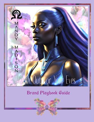
Taglines are glimpses into the personality and flair of a brand (Sloganshub, 2023). The Mandy Madison tagline ‘Attention à Vos Yeux !’ translates in English to say, watch out for your eyes, but is used colloquially, in its original French, to convey that something incredible is about to happen or appear.
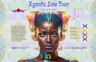
Vision Board - Identity, Sexuality and Transition
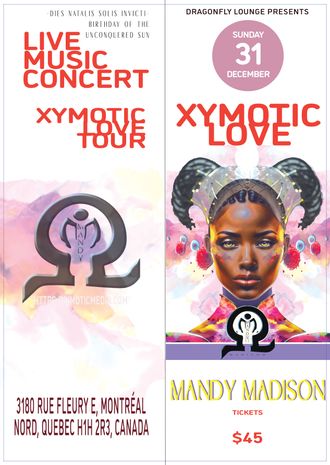

Design Composition and Hierarchy
The Client Conundrum
ERGO
The Design Solution
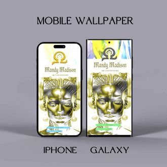

The most incredible imagery without focus can be a detractor when used for branding. The explosive visual appeal of the Mandy Madison brand comes from striking, eye-catching imagery! Warmorkar implies that products must approximate customer expectations (Warmorkar, 2023) and that a brand should visually communicate its tacit and intellectual assets with unfaltering veracity. Mandy Madison adheres to this notion by understanding her brand's underlying objectives, which are identity, reaffirmation, and sexuality.
Consumer distractibility is why Mandy Madison places so much stake in the distinctive visual appeal of the Mandy Madison brand. A definitive persona sets Mandy Madison apart from her competition in the saturated Hip Hop music genre. The Mandy Madison brand achieved its eye-catching appeal by researching shapes that are memetic to humans, like the shapes of dangerous animals and insects, and primary and secondary shapes used to create all shapes to see which ones were the most popular in entertainment. This research yielded that round shapes were desirable, and spideresque shapes with tentacles or arms were generally averse, the impetus for why many elements of the Mandy Madison persona are comprised of myriapod and arachnid-like shapes in symphony with transportive, uplifting variegated hues in modular design composition. This strategy is how Mandy Madison captures viewer attention and conveys threat and protection- alarm and affirmation.

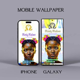
Above Spotify ad graphics and custom screensaver for Iphone and Galaxy phones. Below features the final design for Mandy Madison's Demoiselle Omega parfum.


Color Palette
The Client Conundrum
ERGO
The Design Solution


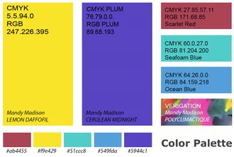
Phoebe Oldrey explains that colors interact with human physiology per their unique spectrum (Oldrey, 2017). Mandy Madison uses this insight in the Xymotic Love Tour billboard by employing variegated red and violet hues. The plurality of red hues 600nm and higher reach the eye quicker and penetrate deeper into the skin, adding physicality to the visual dynamics present at a typical Mandy Madison performance. Another reason why several red hues are used is that red is often ascribed to physical phenomena, like sex, aggressive acts, and the Valentine's Day Heart for Love.
Another unique use of color was to feature colored paper for the Mandy Madison letterhead. Neutral tones such as pastel blue, dove gray, alabaster, and mauve were considered, however, the epiphany that incompatible ink hues with a single hue paper in the unforeseeable future negated this strategy. This is why only the faintest hint of Mandy Madison’s custom Polyclimactique hue was used to infuse and add interest across the Letterset asset.
According to Robinson people wearing red hues or who are surrounded by red are perceived as more attractive, friendly, or approachable (Robinson, 2023) more reasons why variegated red and violet hues were chosen to distinguish the Mandy Madison billboard graphic. Mandy Madison's custom color Polyclimactique hue is also an invention borne from the concept of the kaleidoscope’s interchanging patterns and colors and the timeless symbolism of unity conveyed by the chromatically diverse, unified spectrum of a rainbow. Meta-design color concepts such as these further ameliorate the alternative, diverse tenets of the Mandy Madison brand.

Typography and Font Pairing
The Client Conundrum
ERGO
The Design Solution

Finding a suitable typeface to express the Mandy Madison brand was a labor of compromise. According to typography experts, typefaces can bring emotion and personality to ad pieces or even usurp the function of individual design elements when used imaginatively (Saltz, 2023). The typefaces Germanica and FRESSIA are paired for use as primary fonts of the Mandy Madison brand. Initially, very stylized Afro-Asiatic character conventions were selected by Mandy Madison to convey the diverse, international brand identity of Mandy Madison. However, viewability and practical functions such as body copy formatting, readability, and conversion across media platforms took priority, and initial choices had to be replaced. Color is huge part of the Mandy Madison brand, and copywriters and UX designers like Heryanta, suggest that absolute black, should never be used in typography (Heryanta, 2021) these are other reasons why Mandy Madison chose stylistic, typefaces that would look good when displayed in color.
The ultra-stylized font Biling mi maranthi is replaced by Germanica font for header eye-catchability. The FRESSIA font for readability replaces the Futurism font. The Myriad Pro font is selected over the Tahoma font due to its stout, block-like case and lack of serifs, ligatures, or overstated loops. Pairing the frisky, unconventional Germanica font with the no-nonsense but distinctive FRESSIA font, and Myriad Pro, conveys cohesiveness as the fonts all adhere to an underlying modular symmetry.
Further, the Germanica font, designed by Paul Lloyd was chosen because it is based on a Medieval, Dark Ages theme (Font et al., 2007). The parity is that this long ago era symbolizes great social upheaval and pandemic, which reflect the present day, solidifying the Germanica font as the obvious choice to represent the transitional nature of the Mandy Madison brand.


Logo
The Client Conundrum
ERGO
The Design Solution


