3-COLLABORATION-N A V I G A T I O N-L I N K S

COLLABORATION
A New Dark Ages Renaissance
ān
JUNE - Exaggerated drop shadow -Elena Maria Rogalle
The instructor suggested that the drop shadow in the title of the Lucky Dog Rescue image was too exaggerated. Which was taken to mean that drop shadow had made the composition less effective. What appeared to be a gregarious drop shadow of the title was in fact meant to convey a visual echo or the concept of weeping words.
The feedback should have been applied. However, the input did bring attention to the fact that a visual echo, or weeping words of sorts, could be misconstrued as an ineffective use of a drop shadow. A different ad piece was produced to experiment with a different look and feel. The original, which featured the weeping title or visual echo, remained the primary choice.


twēġen
AUGUST - Poorly aligned text and imagery in video - Adam Baldowski
The instructor commented that the video message with a Margaret Meade quote did not align with an end explosion in the video and suggested that a more positive end would better align. This was a misinterpretation; the Instructor did not share the notion of a compelling connection between the spoken quote and an explosion. The feedback was not viable because the explosion symbolized what happens when ‘the few do not triumph to bring about change, which was the jist of the quote.
Different moods of music and color schemes were experimented with until the idea for a hopeful mood was applied to the overall video to include upbeat, fast-paced music, and instead of an explosion at the end of the video, a word chain ‘STOP THE WAR’ replaced an explosion.
þrī
SEPTEMBER - Incohesive font pairing - Bartley Argo
The instructor suggested that the use of hyper-stylized typefaces, such as Atari Kids, may be more challenging to read and manage across different types of media platforms, such as print-to-web pages. This meant that unique, highly stylized fonts could lack number sets or special characters when necessary. This feedback was valuable. The feedback was tested in text groups for number sets and special characters by the copy and paste of unique typefaces, such as Atari Kids, translated into other fonts. Surprisingly, many ultra-stylized fonts did not translate well or have the full range of compatible numerals or special characters.
Fonts such as Atari Kids, Billing mi marathi, and FTF Indonesiana Serif were initially considered for the Mandy Madison brand but proved to be less versatile for varied media. New fonts such as Germanica, FRESSIA, and Myriad Pro were chosen to facilitate consistent text and typography across multiple platforms.


Myriad Pro is converted to the very decorative font Atari Kids, to reveal there are no number or special character sets; one reason why these type fonts should be avoided for campaigns meant to span different media platforms.

fēower
OCTOBER - Crowded composition lack of free space between elements - Bartley Argo
The instructor critiqued the initial Mandy Madison vision board as appearing too crowded and filled with elements that needed to be given more room to breathe. The feedback meant there was a need for better balance in the composition and clear terminating boundaries for elements to allow them to stand out and fade or flow into other items without creating a crowded look.
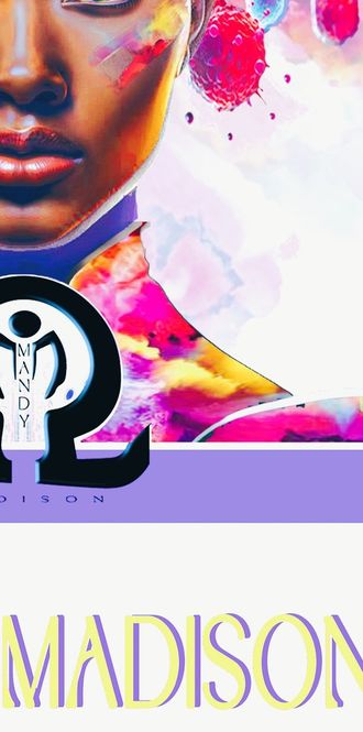
This feedback was of value. The central object, the Mandy Madison face, was resized to allow room for other elements, which were minimized by size or color, to allow more free space between elements in the composition while maintaining initial hierarchical relationships.

.

fīfta
NOVEMBER - Covering and overlapping elements reducing effectiveness of composition - Andrea Kratz
After seeing a masked Mandy Madison brand avatar, the instructor remarked that it is essential to see as much of the eyes as possible when featuring a face in an ad, whether human or animal. This meant there was a level of unreadability or brand tone if a mask half covered the brand avatar’s face and eyes. This was viable since the central element of the vision board was the brand avatar's face, which meant that all aspects of the face that conveyed emotion and tone should be as visible as possible.
Transparency was applied to the mask to suggest more of the underlying eye. The desaturation of the mask was applied to draw more attention to the face and head. Finally, the mask, initially a prime component of the Mandy Madison vision board, was removed after it was agreed upon that one of the most expressive parts of facial anatomy was the eyebrows (Ram, 2024) meaning it was essential to show the eyebrows.


siex
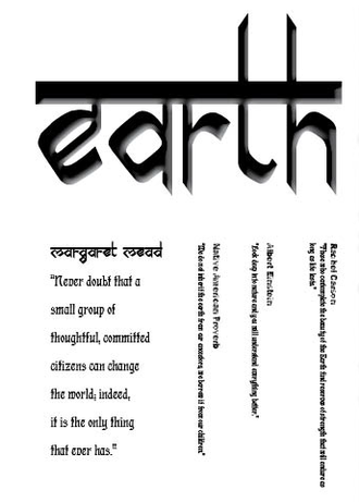
NOVEMBER - Vertical fonts difficult to read - Andrea Kratz
The instructor gave feedback that the vertical script used for the Demoiselle Omega parfum would be challenging to read because people read from left to right in the West, which means that using non-Western writing conventions could frustrate or turn away potential consumers. The feedback was viable because the largest demographic of Mandy Madison consumers lived in culturally Western populations such as Africa, Europe, Canada, and the USA. Albeit, the strategy of the vertical writing was to draw non-Western demographics' attention to the Mandy Madison brand.
The feedback was rejected for the most part. However, some aspects of the feedback still had to be applied to make the Mandy Madison brand more consumer-friendly. Text resizing and text reorientation were applied. The design retained some vertically aligned text to convey the sense of ethnic logographic glyphs (Adgraphix, 2022). Meanwhile, other text elements per the feedback were realigned.


seofon
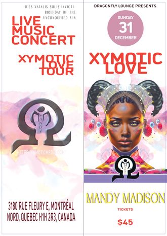
NOVEMBER - Yellow not effective against white background on concert flyer - Andrea Kratz
The instructor made an apparent directive that yellow, as a rule of thumb, should never be used with a white background because yellow is too easily absorbed by white. This suggested that yellow is not effective unless used with a darker background. This observation was valuable and accurate for most applications but not for this ad piece because the use of yellow was a calculated risk taken to spark interest by putting less emphasis on the hierarchy of titles in an image and allowing typeface to be a design element that implores the viewer to focus on the central element or overall concept more critically.
The Mandy Madison Xymotic Love concert flyer was unique. It applied Renaissance theme accouterments to the Mandy Madison avatar to convey the long-ago Renaissance, with a present-day Dark Era slowly morphing into a modern renaissance of tech and isolation. This was the focus of the concert, not so much Mandy Madison, the performer; yellow was the ideal color choice to reduce the title’s prominence while maintaining its compositional relation to other elements on the flyer.


eahta
NOVEMBER - Mandy Madison brand avatar redesigned - Edehn Staplefoote
New strategies had to be employed due to the exhaustive edits to repurpose Mandy Madison imagery for various media due to the time-consuming nature of the Adobe Photoshop layer-driven composition used to produce Mandy Madison images, with limited manpower to promptly task design projects. It was observed that other peers were finding great success in using AI to generate their brand avatars. This observation of AI-generative images was key to solving the problems of time scarcity and refinement flexibility.
The Mandy Madison Adobe composite was run through several online AI image generators, some of which were text-to-image, and others were original image files for AI image interpretation of the image. The problem was that almost all free AI-generated images could vary significantly with unpredictable or inconsistent elements, from precisely the exact text or image input prompts. Finally, an AI text-to-image generator that featured base avatars was located. Of the base avatars, one approximated the attributes of Mandy Madison's physiognomy: the heart-shaped face, broad-spaced eyes, full mouth, and athletic head and shoulder profile, which made it possible to replace the Mandy Madison Adobe Photoshop composition with an AI generative avatar to allow for more flexibility and timely edits to Mandy Madison designs.

Adobe Photoshop Composite Multiple Image Layers

Generative AI Text-to-Image Digital Avatar
nigon
DECEMBER - Missing page numbers and missing fonts - Peter Flood
A peer gave feedback that page numbers from the Mandy Madison brand guide needed to be included. This was a gregarious design oversight indicative of poor planning and unsound quality controls. This feedback was valuable for the success of the Mandy Madison Brand Guide.
It was important not to inspire low confidence in the quality of the Mandy Madison brand by presenting unfinished products. With this in mind, Several methods for representing page navigation consistently were explored, due to page numbers that could not be unlinked or edited intuitively. The problem could not be addressed at that time but noted as a necessary correction.


tīen
DECEMBER - Text box font effect illegible - Matthew Mitchell
A peer suggested that pulled quotes on the left side of alternating spreads in the Mandy Madison Brand Guide were challenging to read due to a fade-in text effect. This was a misinterpretation of the design effect. The fade-in text effect on quotes was meant as textural whispers of auxiliary information defined in other areas of the guide.
The feedback was accurate but needed to be more viable to the overall niche personality the brand guide was meant to convey. The text effect remained, and the feedback was respectfully disregarded. The fade-in text is a design element meant to reinforce text elements and create movement within the niche aesthetic of the Mandy Madison Brand Guide.


endleofan
DECEMBER - Heirarchy and white space - Mattew Mitchell
A peer gave feedback that the lack of contrast in the Mandy Madison Brand Guide made the alignment look somewhat scattered. This suggested that the need for more dynamic contrast would allow the brand guide to be easier to follow. Given that the Mandy Madison aesthetic features ethereal diaphanous principles for many the design elements. Ergo, the reality that mainstream design conventions simply couldn’t be consistently ignored by a studious designer, hence the overall architecture of the Mandy Madison brand guide was reviewed.
Using bold for some fonts, where color and position were key, and resizing where hierarchy over other elements wasn’t key, was applied to create overall less eye fatigue.

